Logo guide
Introduction
 It is a condition of all awards from Northern Rock Foundation that you acknowledge our grant on all promotional material. We require this for two reasons:
- To let members of the public know of the Foundation’s support and
- To promote the Foundation to other organisations who could be eligible for a grant.
Where you should use the logo
You should use the Northern Rock Foundation logo to acknowledge a grant in books, brochures, catalogues, CDs, films, flyers, records, reports, pamphlets, tapes and on the internet. It should also appear on boards describing capital works.
Where not to use the logo
Northern Rock Foundation does not expect you to use the logo in small newspaper advertisements, though large display adverts which acknowledge other funders should include it.
How to use the logo
When you are producing promotional materials, please use the logo as specified and illustrated opposite.
Size, proportion and arrangement
The logo can be enlarged, but must never be used smaller than the minimum reproduction size specified opposite. It should not be distorted or rearranged in any way.
 Colour logo (spot)
• 80% Red (PMS 485)
• 100% Red (PMS 485)
• 100% Blue (PMS 660)
• 100% Red (PMS 485)
• 100% Blue (PMS 660)
Colour logo (process)
• Red (C:0% M:95% Y:100% K:0%)
• Blue (C:90% M:57% Y:0% K:0%)
Black and white logo
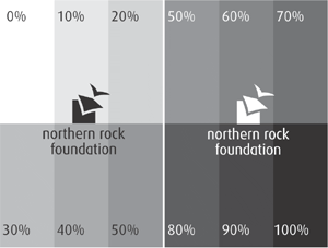
The logo should be used as solid black on all light backgrounds. When used on a dark background the logo should be reproduced in white.
It should never be reproduced as a percentage tint on any background (see below).

The logo on different backgrounds
The examples below show which logo you should use depending on how light or dark the background is.

Download the logo
Click here to download the logo in its various formats.
back top of page